


Unit 3: Carbon in the Future & You
3.1: Your Temperature Connections
FOCUS QUESTION:
What is the pattern for the average temperature for Earth?
Introduction
In Units 1 and 2 of Carbon Connections, you investigated carbon and climate in the past and present. You saw some ways that humans influence the carbon cycle. This is important because it relates to future climate. That is where you can be part of the solution to address climate change. But remember, it is not just you addressing this issue: It is you and thousands of students like you who will make a difference.
In Lesson 3.1, you will start with an activity that shows how scientists determine the Earth's temperature. Then, you will explore Earth's temperature over the past 120 years. With this global record, you can test factors that influence Earth's temperature. What you will learn in Lesson 3.1 includes:
- A network of climate stations gives a single average for global temperature per month.
- The global temperature varies, but it also shows an overall increasing temperature.
- Satellite-based temperature data confirm the ground-based temperature data.
For Lesson 3.1, use the lesson focus question to guide what you learn about carbon and climate.
A. Temperature Averages
Many times in science, you will use an average, or mean, to tell you about sets of measurements. An example is a batting average in baseball. Or, you might be watching your grade point average; it tells you about the kind of grades you are getting in school. In a similar way, scientists use temperature averages as a way to study Earth's climate. Understanding these averages will help you answer the focus question for Lesson 3.1.
Measuring Temperature Activity
Do the Measuring Temperature activity with your class. You will model how many climate stations are used to get a single, average temperature for Earth. You can learn more about networks and averages in the Grid Averages activity at the end of this lesson.
Materials per Team
- Container for water (cup or beaker)
- Thermometer in Celsius (°C)
- Paper towel
Process and Procedure

Follow your teacher's instructions to set up the activity, and then do the steps below:
- Sketch a map of your classroom. Show the location of each water container.
- When directed by your teacher, place the thermometer in the water. Measure and record the water temperature.
- Share temperature data for each container with your class. Make a table of temperature data, or write the temperature on your map.
- Determine the average for all the temperature data. Draw a box around this value.
- The temperature of the beakers around the room may change. Listen to your teacher for whether you will do another measurement. If so, determine if the average temperature of all beakers changes too.
- Consider the container you measured, or any other single container in the classroom. How well does its temperature reflect the mean temperature of all containers?
If you want to learn more about networks and averages, try The Grid Game
The Grid Game
The Grid Game
Scientists use measurements from a network of climate stations to calculate a single value for Earth's temperature. Determining averages from grids shows you another way to model how scientists calculate the Earth's temperature. Rather than use thousands of climate stations, you can use an average from a grid of nine numbers.
When you click on each grid number, you will see a 3x3 group of numbers. Use the steps below for the grids.
Process and Procedure
- Calculate the average (or mean) for grid #1.
- Write your answer in a table (example shown below).
- Determine the averages for grids 2-5.
- Do you see a trend or pattern in the averages? If so, what is it?
- Calculate how the averages for grids 1-5 changed relative to the average for grid 1.
- Do you see a trend for values in step 5? How does a trend compare with what you saw in step 4?
| Grid # | Average for Grid | Change from Gird #1 |
|---|---|---|
| Grid #1 | ||
| Grid #2 | ||
| Grid #3 | ||
| Grid #4 | ||
| Grid #5 |
B. Taking Earth's Temperature
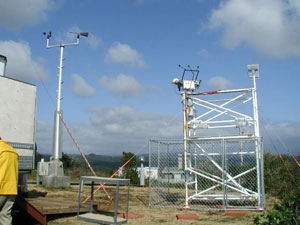
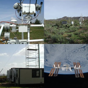
To learn about Earth's climate, scientists need to measure the Earth's temperature. But where would you measure Earth's temperature? You started thinking about this in step 6. If you measured at one place, such as the equator, then the temperature would be too hot to represent all of Earth. If you measured at the poles, the temperature would be too cold. Perhaps you could go halfway, to latitude 45°. But that would not work, because most land and continents are north of the equator. This also raises the question of whether to measure over land, ocean, or maybe both.
To address the issue of where to measure, scientists use measurements from many thousands of stations. These stations make a network that spans Earth. At each station, temperatures are measured whenever possible. Scientists use the daily data to calculate an average per month. Then for each month, the monthly averages for each station in the network are used for one global average. You calculated an average in a similar way in the Measuring Temperature activity.
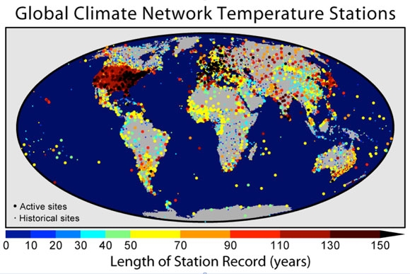
In the case of these temperature data, a simple average does not work. Areas with many stations, such as the United States or Europe, would be overrepresented. This would give an offset, or bias, for areas that have many stations. Thus, scientists combine the data by regions so that the monthly mean for Earth is not biased toward areas with more stations. Because the stations cover all of Earth, the result is one value for all of Earth—the global average.
Watch the animation of global temperatures from 1880-2008. Notice that:
- The "clock" in the upper-left shows the 5-year periods for the monthly averaged data.
- The upper-right corner shows the temperature anomaly (Ta) for the globe. The anomaly is how much a value differs from the average in 1951-1980. For example, over the period of 1990-1994, the Ta was +0.24°C warmer than the average for 1951-1980.
- Colors show regional anomalies. Blues are colder than the 1951-1980 average; and yellow, oranges, and reds are above average. Gray means not enough data.
Global Temperature Animation
Watch the animation of global temperatures again, and then complete steps 7-9.
- Estimate the temperature anomaly for the year you were born. To do that, go to the five-year interval with the year of your birth in it (for example, for 1995, go to 1993-1997).
- What regions of the globe show large anomalies at that time? Were they cold or warm?
- What trend of temperature do you see over the entire animation? Does this trend match the changing values of Ta (upper-right corner)?
Global Temperature Record: NASA/GISS Scientists
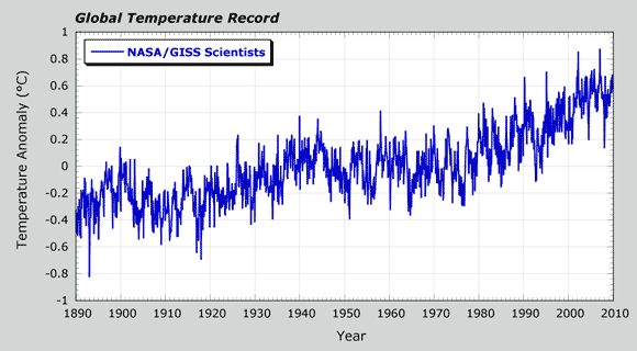
- NASA scientists have collected temperatures from the global network. They have average data for temperatures from 1890-2010.
- What trend of temperature do you see in their data?
- How does this trend compare with the trend that you described in step 9 for the animation?
Global Temperature Record: NASA/GISS Scientists & British Climate Scientists
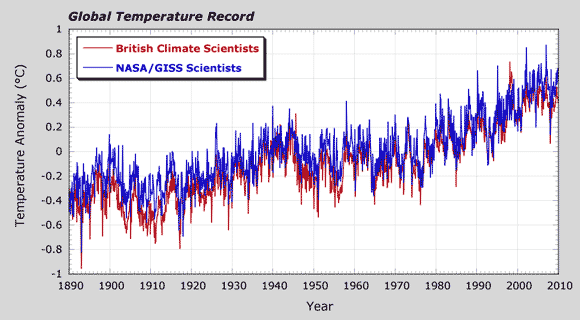
- Climate scientists from other countries have also analyzed temperature data from the global network of climate stations. Temperature results for British climate scientists are in the graph. Compare their temperature results with the NASA temperatures by completing the following sentences.
A similarity in the two data sets is _____________________.
A difference in the two data sets is _____________________.
The temperature data for Earth improved in the late 1970s for several reasons. First, the number of climate stations increased in the 1960s and 1970s. Second, a new generation of NASA satellites was launched in late 1978. One satellite looked at changes in radiation from the Sun. Another satellite was used to determine temperature of the lower atmosphere. These temperatures from satellites were an excellent way to test if the ground-based stations were accurate. Thus, data from the past 30 years (1979-2010) is the highest-quality data on Earth's climate.
Ta Explorer
Launch the Ta Explorer. Remember, the Ta stands for "temperature anomaly." You can use Ta Explorer to compare temperatures from different climate teams from 1979 through 2010. The data includes the ground-based stations, as well as satellite-based data. Be sure to "grab" the temperature records, and slide them up and down. This lets you compare and contrast the temperature from different research teams. You can also compare the ground-based data with the satellite-based data. This helps you see overall patterns of change in Earth's temperature.
- The National Oceanic and Atmospheric Administration (NOAA) also has scientists who closely monitor Earth's temperature from the climate stations. How does the NOAA temperature record compare with the NASA and British records? Use the Ta Explorer to overlay and compare these three records.
Click to select a record, then use mouse to drag the curve up or down. - Change scales by clicking on the "1979-2010" button. How does a ground-based record compare with a satellite-based record? For example, how do the NOAA and RSS data compare?
- Using any record, look at the change from 1991 to 1992. Is the change a cooling or warming? You will study this change more in Lesson 3.2.
- Watch the four-minute video by NASA, "Taking Earth's Temperature." As you watch, record answers to these questions:
- How do scientists get the most-reliable measurement of Earth's overall temperature?
- What does the GLORY mission measure and monitor?
- What do you think is a climate forcing? Give an example from the video to show your thinking.
C. Manipulating Models
Investigating Earth's temperature record raises an important question: What factors affect Earth's climate? In Lesson 3.2, you will get to test several factors. You will be like a scientist as you explore this question with the Carbon Connections Climate Model. By adjusting the factors in the climate model, you will get to test which factors can cause Earth's temperature to change.
If you are unable to see the interactive, click here to open it in a new tab.
Climate Model
To think about factors that affect Earth's temperature, do the steps below:
- Think of one or two factors that you think could affect the global temperature.
- Write these on the left side or your notebook.
- On the right side, write whether you think that they might lead to warming or cooling.
- Discuss your ideas with a classmate near you. Did your classmate have an idea that was different from yours? Revise your list to include any new factors you learned from your classmate.
- Now open the Carbon Connections Climate Model. The four slide bars are four key forcings on the global temperature. You can change these forcings:
- El Niño/La Niña Cycles. These cycles occur in the Pacific Ocean at the equator.
- Volcanic Eruptions. These eruptions send ash and gas into the atmosphere.
- Solar Cycles. These are changes in solar radiation from the Sun.
- Anthropogenic. These are human-related influences on Earth's climate.
- As you change the forcings, notice the three lines on the graph. They span more than 30 years, from 1979-2011.
- Black. This is the measured temperature data (Ta).
- Green. This model is the best match to the temperature data (that is, the "best-fit" model).
- Red. This shows the model results as you adjust the climate forcings.
As you test the model, also notice the moving bar to the right of the graph. Before you start Lesson 3.2, see if you can determine what the red bar tells you.
D. Reflect and Connect
- Summarize what you have learned in Lesson 3.1 by answering the focus question: "What is the pattern of Earth's average temperature?" Use the Ta Explorer from the periods 1880-2011 and 1979-2011 for examples in your answer.